Page 1 of 2 12 LastLast
Results 1 to 20 of 23

Thread: Mega Drive Box Art — Across the Regions

  1. #1
    Insert Coin (Level 0) timewarpgamer's Avatar
    Join Date
    May 2008
    Location
    Planet Funkotron
    Posts
    101
    Thanks Thanks Given 
    0
    Thanks Thanks Received 
    0
    Thanked in
    0 Posts

    Default Mega Drive Box Art — Across the Regions

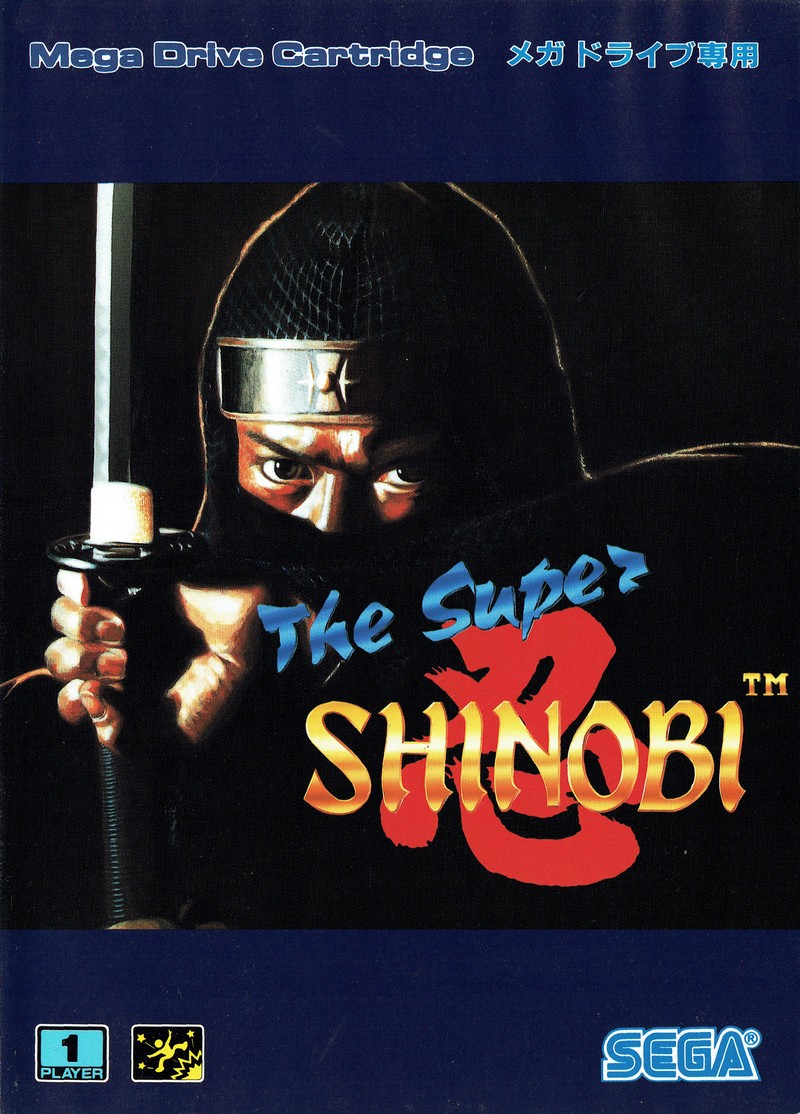
    This is a little fascination of mine: How games are marketed with totally different box art (sometimes even different titles as well) across North America, Europe, and Japan. My latest focus is the Mega Drive, and you can find my comparison/critique here:

    http://timewarpgamer.com/features/ge...omparison.html

    Delving into this topic is a big one, so I turn to you to provide additional examples. One person can only track down so many pieces of box art x 3 for each game! And if you're into this sort of art discussion, you might like my first foray into this world, focused on the TurboGrafx-16/PC-Engine:

    http://timewarpgamer.com/features/tg...disparity.html
    I run TimeWarpGamer, dedicated to 8/16-bit retro gaming. I'm also on Twitter, which is ideal for following the latest retro updates.

  2. #2
    Apple (Level 5) MrRoboto19XX's Avatar
    Join Date
    Apr 2005
    Location
    Annapolis, MD
    Posts
    1,121
    Thanks Thanks Given 
    0
    Thanks Thanks Received 
    0
    Thanked in
    0 Posts
    Xbox LIVE
    St Aspartame

    Default

    This is pretty awesome, I love this kind of stuff. Well done and thanks!
    Welcome to Macintosh.


  3. #3
    Pear (Level 6) vivaeljason's Avatar
    Join Date
    Sep 2009
    Location
    Central NJ, USA
    Posts
    1,298
    Thanks Thanks Given 
    0
    Thanks Thanks Received 
    0
    Thanked in
    0 Posts

    Default

    All I've got to say is that the Genesis/Mega Drive article was great; I've never really thought about variations in box art prior to now, but all I can say is that in a lot of cases, the US got the short end of the stick when it came to the box.

    I'm going to the TG16 one now, and I'm sure it'll be more quality stuff.

    Man, now I want to read an SNES one.
    Settle down, raise a family, join the PTA
    Buy some sensible shoes and a Chevrolet
    And party 'till you're broke and they drag you away
    It's okay, you can dare to be stupid

  4. #4
    Great Puma (Level 12) Steve W's Avatar
    Join Date
    Jun 2006
    Location
    DFW Metroplex, Texas
    Posts
    4,644
    Thanks Thanks Given 
    67
    Thanks Thanks Received 
    43
    Thanked in
    39 Posts

    Default

    I've always wondered if there wasn't another reason why the US branch of Hudson couldn't get access to the original art. There's the thought that the art was too Japanese for Western tastes, but that's not always true. Dungeon Explorer for the PC Engine is light years better than the one for the US release, and there's nothing at all that looks Eastern about the PC Engine version. So why wouldn't they use the original art?

  5. #5
    Cherry (Level 1) PresidentLeever's Avatar
    Join Date
    Oct 2007
    Location
    sweden
    Posts
    263
    Thanks Thanks Given 
    0
    Thanks Thanks Received 
    0
    Thanked in
    0 Posts

    Default

    Nice to read this kind of article by someone who knows what they're talking about I really enjoyed both of these.
    If you want to expand on them, I guess you could compare the box art to the actual in-game graphics as well.

  6. #6
    Strawberry (Level 2) c2000's Avatar
    Join Date
    Dec 2002
    Location
    The Netherlands
    Posts
    437
    Thanks Thanks Given 
    0
    Thanks Thanks Received 
    0
    Thanked in
    0 Posts

    Default

    Nice feature!

    BTW Why does the 'quick reply' button gives me the 'quote' screen?!

  7. #7
    The Gentleman Thief Custom rank graphic
    Baloo's Avatar
    Join Date
    May 2009
    Posts
    3,056
    Thanks Thanks Given 
    1
    Thanks Thanks Received 
    5
    Thanked in
    5 Posts
    PSN
    BalooDP
    Steam
    baloorj

    Default

    Japanese Genesis/Megadrive art has so much anime, sometimes it doesn't seem to fit very well.

  8. #8
    Insert Coin (Level 0) timewarpgamer's Avatar
    Join Date
    May 2008
    Location
    Planet Funkotron
    Posts
    101
    Thanks Thanks Given 
    0
    Thanks Thanks Received 
    0
    Thanked in
    0 Posts

    Default

    Quote Originally Posted by vivaeljason View Post
    All I've got to say is that the Genesis/Mega Drive article was great; I've never really thought about variations in box art prior to now, but all I can say is that in a lot of cases, the US got the short end of the stick when it came to the box.

    I'm going to the TG16 one now, and I'm sure it'll be more quality stuff.

    Man, now I want to read an SNES one.
    Thanks for the compliments; I'm glad you enjoyed it. You'll be pleased to know that SNES is next on my list. Anyone know good places to find PAL SNES box art? I've got the US and Japan covered with ease, but the European releases are elusive.
    I run TimeWarpGamer, dedicated to 8/16-bit retro gaming. I'm also on Twitter, which is ideal for following the latest retro updates.

  9. #9
    Pretzel (Level 4)
    Join Date
    Sep 2003
    Posts
    925
    Thanks Thanks Given 
    0
    Thanks Thanks Received 
    0
    Thanked in
    0 Posts

    Default

    Are you some sort of art major? I swear reading those articles reminded me of the critiques i go through at KCAD.

  10. #10
    ServBot (Level 11) TonyTheTiger's Avatar
    Join Date
    Jan 2008
    Location
    New Jersey
    Posts
    3,550
    Thanks Thanks Given 
    0
    Thanks Thanks Received 
    1
    Thanked in
    1 Post

    Default

    I actually like the American Elemental Master box art.

  11. #11
    Insert Coin (Level 0) timewarpgamer's Avatar
    Join Date
    May 2008
    Location
    Planet Funkotron
    Posts
    101
    Thanks Thanks Given 
    0
    Thanks Thanks Received 
    0
    Thanked in
    0 Posts

    Default

    Quote Originally Posted by Doonzmore View Post
    Are you some sort of art major? I swear reading those articles reminded me of the critiques i go through at KCAD.
    Thanks, Doonzmore. That's quite the compliment. I used to be really into art in high school, and when I was writing the critiques I definitely thought of my old art teacher and the various categories she used to critique my work. So, no official art credentials, but I've always enjoyed art. If a position for video game art critiquing opens up at KCAD, please let me know, haha.
    I run TimeWarpGamer, dedicated to 8/16-bit retro gaming. I'm also on Twitter, which is ideal for following the latest retro updates.

  12. #12
    Part of the #vbender crew Custom rank graphic
    Ze_ro's Avatar
    Join Date
    Dec 2003
    Posts
    2,522
    Thanks Thanks Given 
    0
    Thanks Thanks Received 
    3
    Thanked in
    3 Posts
    Xbox LIVE
    Abstract Zero
    PSN
    Ze_roV
    Steam
    abstractzero

    Default

    It's interesting seeing comparisons like this, but it seems that they're invariably from an anime fan who's pissed off that the style never made it onto the North American versions.

    Frankly, the North American Genesis box arts don't look bad at all to me, and many of the Japanese ones look incredibly bland... especially the Warsong art (which might as well be for anything, it's just a guy in armor with marble pattern shelf paper behind him). The anime characters on the Landstalker (looks like Link in armour) and Elemental Master (The villain looks completely out of proportion) boxes also look quite poorly drawn to me. I honestly prefer the North-Am box art for Elemental Master.

    When it comes to TG16 though, I have to admit that almost every North American release had laughably bad box art.

    --Zero

  13. #13
    Great Puma (Level 12) Custom rank graphic
    Tupin's Avatar
    Join Date
    Aug 2008
    Posts
    4,469
    Thanks Thanks Given 
    1
    Thanks Thanks Received 
    10
    Thanked in
    10 Posts

    Default

    This is my personal favorite, and this happens to this day, especially with Kirby games:


    American


    Japanese

    At least it's not AS bad as Kirby, in one cover all they did was draw two slanted lines over his eyes to indicate anger.

  14. #14
    Strawberry (Level 2) ccovell's Avatar
    Join Date
    Apr 2007
    Location
    Japan
    Posts
    554
    Thanks Thanks Given 
    0
    Thanks Thanks Received 
    0
    Thanked in
    0 Posts

    Default

    The cover of Bare Knuckle II always looked familiar, until I found the source of the red villain in the back:


    It's from a revue of Arnold Schwartzenegger ads in a Japanese Total Recall commemorative book. Cover artists steal from movie posters and photographs all the time, so this is no surprise.

    More:
    http://www.disgruntleddesigner.com/c...ges/arnie0.jpg
    http://www.disgruntleddesigner.com/c...ges/arnie1.jpg
    http://www.disgruntleddesigner.com/c...ges/arnie2.jpg
    http://www.disgruntleddesigner.com/c...ges/arnie3.jpg
    http://www.disgruntleddesigner.com/c...ges/arnie4.jpg
    http://www.disgruntleddesigner.com/c...ges/arnie5.jpg
    http://www.disgruntleddesigner.com/c...ges/arnie6.jpg

    And, in the SOR2 cover, isn't Max right there, in the top-left corner, giving some punk an elbow?

  15. #15
    Insert Coin (Level 0) timewarpgamer's Avatar
    Join Date
    May 2008
    Location
    Planet Funkotron
    Posts
    101
    Thanks Thanks Given 
    0
    Thanks Thanks Received 
    0
    Thanked in
    0 Posts

    Default Part III: Sega CD

    Thanks for all of your feedback. I just posted a new box art feature, focused on the Sega CD here:

    http://timewarpgamer.com/features/bo...y_sega_cd.html

    I also started a new DigitPress thread, and I'd provide the link to it except that I don't know how to do that, due to the frame-based architecture of this website. Anyway, I welcome your feedback wherever you may provide it.
    Last edited by timewarpgamer; 12-08-2009 at 10:36 PM. Reason: messed up the URL the first time
    I run TimeWarpGamer, dedicated to 8/16-bit retro gaming. I'm also on Twitter, which is ideal for following the latest retro updates.

  16. #16
    Kirby (Level 13) Push Upstairs's Avatar
    Join Date
    Feb 2004
    Location
    somewhere between the past and the future
    Posts
    5,464
    Thanks Thanks Given 
    0
    Thanks Thanks Received 
    0
    Thanked in
    0 Posts

    Default

    I'm pretty sure "Revenge of Shinobi" is the only US cover that looks better than the Japanese version.

    U.S.


    Japan


    While this lifted Sonny Chiba image is cool, the re-arranged back artwork onto the front of the US cover looks better. I think the plain blue bars on the JP cover kills it.

    Possibility is infinity! You must be satisfied!

    You just can't handle my jawusumness responces. -The Sizz


  17. #17
    Insert Coin (Level 0)
    Join Date
    Dec 2009
    Posts
    4
    Thanks Thanks Given 
    0
    Thanks Thanks Received 
    0
    Thanked in
    0 Posts

    Default

    I thought the Valis series had some very poor US covers except for the Genesis Valis III. That one actually made me want to buy the game back then.

    I agree that bad cover designs hurt the TG-16. The overall template design looks good but the game covers themselves look way too generic.
    It's too bad that American companies didn't deem the original anime covers marketable. As a kid, anything that looked like it was in the same vein as Transformers or Voltron would catch my eye.

    Ernest Evans had a pretty bland cover as well. The game itself has anime cutscenes and looks like it was based on a cartoon. The US cover though has an off-brand Indiana Jones on the cover. As a kid I thought, "it looks like some cheap Temple of Doom wannabe."

  18. #18
    Strawberry (Level 2) Sosage's Avatar
    Join Date
    May 2004
    Location
    Bay Area, CA
    Posts
    545
    Thanks Thanks Given 
    0
    Thanks Thanks Received 
    0
    Thanked in
    0 Posts

    Default

    Cool articles. I just don't agree about Elemental Master. That U.S. cover is a really good render. The composition of the painting itself is well thought out, using a spiral-style lay out to guide the eye (you sweep from the blue, to the wizard's arms which swoops towards the larger hands, which sweep up to the head). It's thrown off a bit with the overall placement, looking like the painting was cropped wrong and the blue title fighting for attention (but that is the most important part usually). The rendering may not be what was cutting edge back then, but some people were still stuck in a time where Frazetta-inspired fantasy painting was king (all those romance book cover painters needed work).

    The Japanese version is a complete mess in every way possible. Composition and color is just all over the place. Light blue is obviously the strong eye catcher, but it draws the eye away from the title (both in the blast and the fairy wings). Every figure in that picture is in danger of not being in the same space, let alone being aware of each other (the protagonist is the worst...he not only isn't shooting in the right direction as you said, but he isn't even looking at anyone).

    I'm just saying, U.S. version IMO is much more competent than you made it seem. It is no where near the wtf-nature of the Japanese version. :P

    Different opinions though.
    -Sosage


    WTF is a Dim-Mac?!?!?

  19. #19
    Insert Coin (Level 0) timewarpgamer's Avatar
    Join Date
    May 2008
    Location
    Planet Funkotron
    Posts
    101
    Thanks Thanks Given 
    0
    Thanks Thanks Received 
    0
    Thanked in
    0 Posts

    Default

    Quote Originally Posted by Push Upstairs View Post
    I'm pretty sure "Revenge of Shinobi" is the only US cover that looks better than the Japanese version.
    While this lifted Sonny Chiba image is cool, the re-arranged back artwork onto the front of the US cover looks better. I think the plain blue bars on the JP cover kills it.
    Wow, you're totally right. I'd seen the Japanese box before, but I never put it next to the American one.
    I run TimeWarpGamer, dedicated to 8/16-bit retro gaming. I'm also on Twitter, which is ideal for following the latest retro updates.

  20. #20
    ServBot (Level 11) TonyTheTiger's Avatar
    Join Date
    Jan 2008
    Location
    New Jersey
    Posts
    3,550
    Thanks Thanks Given 
    0
    Thanks Thanks Received 
    1
    Thanked in
    1 Post

    Default

    Quote Originally Posted by Push Upstairs View Post
    I'm pretty sure "Revenge of Shinobi" is the only US cover that looks better than the Japanese version.
    I personally think the U.S. got the better deal with all the Sonic covers, too.

Similar Threads

  1. Mega Amp - new audio circuit for Genesis/Mega Drive
    By Guntz in forum Classic Gaming
    Replies: 0
    Last Post: 01-02-2014, 05:36 PM
  2. Japanese SEGA Mega Drive Multi Mega console (import CDX)
    By Black_Tiger in forum Buying and Selling
    Replies: 0
    Last Post: 02-03-2013, 11:22 AM
  3. Replies: 1
    Last Post: 06-21-2007, 05:18 PM
  4. 1hour left !Sega Amstrad Mega PC 386 SX with Mega Drive Slot
    By danielscheil in forum Buying and Selling
    Replies: 2
    Last Post: 03-24-2006, 01:50 PM
  5. Replies: 7
    Last Post: 09-24-2003, 04:53 PM

Posting Permissions

  • You may not post new threads
  • You may not post replies
  • You may not post attachments
  • You may not edit your posts
  •