


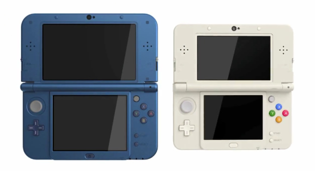
Wtf is this? The redesign looks like absolute ass. They put a start and select button in the bottom right corner taking up a large amount of space, the button layout is exactly the same, and the c stick is shoved into the small portion of space above the buttons and between the screen. Really Nintendo, why not base the upgrade on the 3DS XL where the start and select are plastic hinges below the screen and that wide open area below the abxy face buttons, you could move the face buttons to that section and then put the c stick where the buttons are, directly across the other analog stick.Originally Posted by Leo_A

These companies have no idea what they're doing. Sony stuck the Vita analogs way too close to the face buttons and Nintendo puts the second analog in such a ridiculously akward place, both close to the face buttons and the hinge when the system closes. I'm pretty sure playing the 3DS with both analogs and repeated button inputs like L and R will not be an enjoyment.


 Reply With Quote


 The DS was a wild and fun ride off and on, but it never got me the pleasure the GBA did or the consistent use either. My 3DS use is spotty I won't lie, but it's more about the whole living situation, not the games, as I like what I have and have kept much of what I bought too.


