I recently completed my latest box art disparity feature, this time covering Sega's 8-bit console. Anyway, I thought you might enjoy it.
http://timewarpgamer.com/features/bo...arity_sms.html
Looking forward to see what y'all think.


I recently completed my latest box art disparity feature, this time covering Sega's 8-bit console. Anyway, I thought you might enjoy it.
http://timewarpgamer.com/features/bo...arity_sms.html
Looking forward to see what y'all think.
I run TimeWarpGamer, dedicated to 8/16-bit retro gaming. I'm also on Twitter, which is ideal for following the latest retro updates.

The Sega Master System had some of the worst box art of all time. This was a fun read.
Thanks, man. Ain't that the truth! I remember thinking the TurboGrafx-16 had horrible box art, but it doesn't even begin to sink to the depths of the Master System.Originally Posted by TonyTheTiger

Can anyone even begin to explain the horror that is non-Japanese SMS box art?
I run TimeWarpGamer, dedicated to 8/16-bit retro gaming. I'm also on Twitter, which is ideal for following the latest retro updates.

It is like they didn't even try for some of the box art
Or they got too cheeky and thought that bad box art would somehow attract more attention and help them sell more copies.
I run TimeWarpGamer, dedicated to 8/16-bit retro gaming. I'm also on Twitter, which is ideal for following the latest retro updates.
I don't even like most of the Japanese art. It's all pretty uninspired. It just happens to cover more real estate on the box.
"Kids love graph paper... right? Let's base our entire marketing campaign on that!"
I can't believe there's SMS box art that's worse than Black Belt and Pro Wrestling:
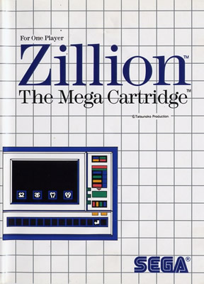
Zillion
What about those stupid Mega Card covers?
eBay Auctions / GameTZ profile / DP Feedback / Youtube / Twitter / RateYourMusic

the art is indeed bad, but i do appreciate uniformity. i also love the plastic clam shell cases, i believe the master system was the first to use them instead of paper.
so while they are ugly to look at from the front, on a shelf with spines showing i still go for the US versions

I kind of like the SMS grid design. Some of the artwork was hideous, but the bigger problem with the system was the total lack of artwork on the cartridge label. Number 1 reason I'll never collect it.
I also read your comparisons of artwork for Genesis, NES, SNES, etc. across the regions. I will agree that Japanese artwork was much more actual artwork. Very beautiful. However, in terms of marketing, a recipe for failure. The designs employed for those systems in the USA were usually the right choice. Nintendo using a standard outline color on its boxes, and Konami and Capcom often following suit. SEGA using the same outline for nearly all games, also a great idea. The other thing is the Japanese art was much more graphic, which wouldn't have flown here. The SNES Super Metroid is a great example. The Japanese art was very detailed, but the US was just the two characters cropped out and in only a few bright colors. Artistically a letdown, but much more of an eye grabber! That was the key, it had to help the sales.
The Paunch Stevenson Show free Internet podcast - www.paunchstevenson.com - DP FEEDBACK

Come on now...what kid wouldn't want a game with a microwave oven on the cover?
Dude that grid graphic is just sad... nobody's THAT uninspired. btw: i want the microwave game with invaders in it
A grid itself isn't necessarily a problem. The early Genesis boxes proved that with the right colors and design it doesn't look half bad. The problem is that unlike the Genesis, the Master System box art makes the grid a major focus rather than just a template. Your eyes can't help but see some cheap doodles on graph paper.

You forgot the worst one, Pro Wrestling. That cover still baffles today.
I've always liked the uniformity and approach for the SMS covers in the US, I think the flaw with the early ones like OutRun or Pro Wrestling is that the simple design just isn't inspired. It's pretty cheap looking. Other games, like Astro Warriors, The Ninja or Gangster Town actually have pretty flattering minimalist designs.
After the first couple of years of designs, though, the art really came into its own when they started using more cover real estate. There are dozens of beautifully designed covers, from the Golvellius and Phantasy Star mentioned in the article, to Golden Axe Warrior, Kenseiden, Psycho Fox, SpellCaster, Miracle Warriors, Blade Eagle 3-D, Sonic the Hedgehog, etc. Some of those covers are my favorites on any console.
The Japanese did it right, outside of using cardboard boxes, always sticking to a uniform design but always peppering it with some grand artwork on the front. They always made the games look so epic, even if they were just marginal shooters or sports games.
That's one thing I've always liked about collecting SEGA games, outside of the Genesis, the packaging stays pretty uniform throughout the system's run (exceptions being the short-lived cardboard cases for SEGA CD games or the mid-way change to black for the Dreamcast). Master System, SEGA CD, 32X and Saturn games look amazing on a shelf.
"Enduro" is a symbolic journey through life via the media of a race.

--Zero
Agreed. Although it spread to MD early on- just look at the full JP box for Space Harrier II. I don't know what's worse- the game's choppiness or the box's back cover.

I have always hated that awful white and black grid style. Kind of.. sterile. Thank god they stopped using that similar style on the Genesis.
DERP
 Posting Permissions

 Reply With Quote