Page 1 of 2 12 LastLast
Results 1 to 20 of 23

Thread: Favorite Genesis Box Art Style

  1. #1
    Banana (Level 7) thetoxicone's Avatar
    Join Date
    May 2004
    Location
    Fairbanks, AK
    Posts
    1,510
    Thanks Thanks Given 
    0
    Thanks Thanks Received 
    0
    Thanked in
    0 Posts

    Default Favorite Genesis Box Art Style

    Do any of the other genesis collectors have a favorite type of genesis box art?

    Personally I like the original black checkered look that the boxes had when genesis first came out. Second place to me would be the two color EA boxes (Haunting, Rings of Power, first couple madden's, first couple nhl's)

    My least favorite ones are the white boxes that EA's sports titles started coming out in and realtec's copy of the red stripe genesis boxes.

  2. #2
    Kirby (Level 13) Custom rank graphic
    MegaDrive20XX's Avatar
    Join Date
    Jul 2004
    Location
    Waco TX
    Posts
    5,921
    Thanks Thanks Given 
    0
    Thanks Thanks Received 
    0
    Thanked in
    0 Posts

    Default

    I still love the artwork on this one

    Yet the Japanese verison


    is a bit on the traditional style...but it's a tie for me on which I like better (Yet the European verison has the same as JPN)
    These cartridges are dirty as hell and I'm not going to take it anymore!

  3. #3
    Pretzel (Level 4) Custom rank graphic
    Duncan's Avatar
    Join Date
    Jun 2003
    Location
    Colorado Springs
    Posts
    885
    Thanks Thanks Given 
    0
    Thanks Thanks Received 
    0
    Thanked in
    0 Posts
    Xbox LIVE
    Duncan1800
    PSN
    Duncan1800

    Default

    The black-checked boxes look great on the shelf right under my white-checked SMS boxes. So, those.

    The red-striped boxes are nice in their own way, but it would look cooler if I had more blue-striped Sega CD boxes to go along with them for contrast. Or, if I ever get off my ass and search out a 32X and some yellow-striped games for it.
    Active systems owned: Wii, X360, PS3
    Inactive systems owned: RCA, INTV2, NES, SMS, Genesis, Lynx, SNES, Saturn, PS1, GBC, DC, PS2, GBA, Xbox, GC, PSP, DS
    Systems wanted: Coleco, 7800, TG16, GG, 3DS, Vita, WiiU

  4. #4
    drowning in medals Ed Oscuro's Avatar
    Join Date
    Nov 2002
    Posts
    16,556
    Thanks Thanks Given 
    3
    Thanks Thanks Received 
    1
    Thanked in
    1 Post

    Default Re: Favorite Genesis Box Art Style

    Ugh, realtec's red boxes (Funny World/Balloon Boy) are the worst I've seen.

    I like EA's PGA Tour box...extra big! :D

    The red stripe boxes are awesome. I also like the blue European boxes.

    Nothing beats the Japanese boxes though.

  5. #5
    Apple (Level 5) Lord Contaminous's Avatar
    Join Date
    Oct 2003
    Location
    Perth Amboy, NJ
    Posts
    1,036
    Thanks Thanks Given 
    0
    Thanks Thanks Received 
    0
    Thanked in
    0 Posts

    Default


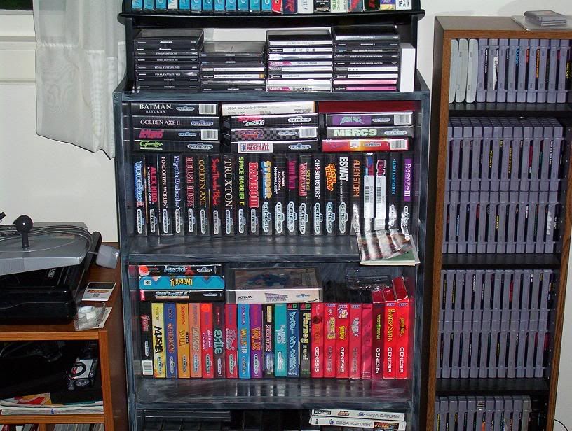
    I like those black Genesis cases made until mid-1993. In this shelf I got the Genesis logo styles grouped together. The evolution of these logos are very interesting.

    The logo used for the Genesis launch games in 1989

    1990. The sky blue logo and is the first to don the words "16-bit Cartridge"

    1991. Slightly smaller than the previous one, and bleached white.

    1992. Sega then moved to a glossy metallic look.

    Then 1993 brought the red Genesis boxes that accompanied the ugly Genesis model 2 which I didn't like that much.

  6. #6
    ServBot (Level 11) Iron Draggon's Avatar
    Join Date
    Nov 2003
    Location
    Fort Worth, TX
    Posts
    3,289
    Thanks Thanks Given 
    0
    Thanks Thanks Received 
    0
    Thanked in
    0 Posts

    Default

    All the Renovation games, definitely. They had the best box art by far. After that, the red stripes, the black grids, and the two-tone EA's. The white EA Sports boxes were very nice too, and so were the Sage's Creation games, so the only ones that weren't so nice were the Realtec games, but they tried.
    You can't run with the big dogs if you pee like a puppy!

    Get BIT!

  7. #7
    Lvl 99 Custom rank graphic
    Daria's Avatar
    Join Date
    Mar 2004
    Posts
    5,214
    Thanks Thanks Given 
    0
    Thanks Thanks Received 
    3
    Thanked in
    3 Posts
    Xbox LIVE
    Nymphomatic

    Default

    Quote Originally Posted by Iron Draggon
    All the Renovation games, definitely. They had the best box art by far.
    Ditto.

    I love the way Renovation's box art wraps around the box and the information on the back fits into a border that's actually part of the image.

  8. #8
    Strawberry (Level 2) delafro's Avatar
    Join Date
    Aug 2004
    Location
    Across the Sea
    Posts
    559
    Thanks Thanks Given 
    0
    Thanks Thanks Received 
    0
    Thanked in
    0 Posts

    Default

    Well, after seeing that above pic, I might just have to say the black and white checkers ones. Still, I'm partial to the red stripes myself, because I played more of those "back in the day".

  9. #9
    Late to the party DigitalSpace's Avatar
    Join Date
    Feb 2004
    Location
    Portland, OR
    Posts
    10,626
    Thanks Thanks Given 
    0
    Thanks Thanks Received 
    0
    Thanked in
    0 Posts

    Default

    I liked the original black boxes the best, although I will admit it got dated after a few years. Sega could have done better than a red stripe, though. But sometimes the red stripes can manage to blend well with box art, such as with the Castlevania Bloodlines box art posted above.

    Collection List | Twitter
    Check out the new N64 Rumble Pak. See how it feels to feel what you see.

  10. #10
    Kirby (Level 13) Push Upstairs's Avatar
    Join Date
    Feb 2004
    Location
    somewhere between the past and the future
    Posts
    5,464
    Thanks Thanks Given 
    0
    Thanks Thanks Received 
    0
    Thanked in
    0 Posts

    Default

    I like the black checker box covers over the red striped boxes.

    Those gray gridlines are just so damn classy.

    Possibility is infinity! You must be satisfied!

    You just can't handle my jawusumness responces. -The Sizz


  11. #11
    Key (Level 9)
    Join Date
    Oct 2003
    Location
    Stomping around Hyrule.
    Posts
    1,851
    Thanks Thanks Given 
    0
    Thanks Thanks Received 
    0
    Thanked in
    0 Posts

    Default

    I like the clean look of the white EA cover spines the best. Second would be the black grid spines......followed by the blue spines then the red.

    However...if we are looking at the face of the boxes, I like the EA ones best, the red ones second, blue third and black grid least of all.

    I really don't like the red cardboard boxes. Finding them in the wild without tears and creased instruction books is a pain in the ass.

    My favorite Genny cover thus far is Sword Of Vermillion. Most likely always WILL be.

  12. #12
    Pac-Man (Level 10) NESaholic's Avatar
    Join Date
    Jul 2004
    Location
    The Netherlands
    Posts
    2,241
    Thanks Thanks Given 
    0
    Thanks Thanks Received 
    0
    Thanked in
    0 Posts

    Default

    This is my favourite....


  13. #13
    Great Puma (Level 12) anagrama's Avatar
    Join Date
    Dec 2002
    Location
    Newcastle, UK
    Posts
    4,704
    Thanks Thanks Given 
    0
    Thanks Thanks Received 
    1
    Thanked in
    1 Post

    Default

    Top of the pile by a long long distance is the Japanese Mega Drive boxes - in almost every case they're far superior to the Western releases.
    After that, I prefer the black PAL Mega Drive boxes - not sure why, but they are almost always that little bit nicer than black Genesis boxes. The later blue PAL boxes are probably next, and bottom of the pile are those irritating 3rd Parties who could never decide on a uniform box style, thus create ugly clashing messes on my shelves

  14. #14
    Apple (Level 5) Barbarianoutkast85's Avatar
    Join Date
    Mar 2004
    Location
    Around Harrisburg, PA
    Posts
    1,073
    Thanks Thanks Given 
    0
    Thanks Thanks Received 
    0
    Thanked in
    0 Posts

    Default

    I like the ones with the red stripes there pretty...

  15. #15
    drowning in medals Ed Oscuro's Avatar
    Join Date
    Nov 2002
    Posts
    16,556
    Thanks Thanks Given 
    3
    Thanks Thanks Received 
    1
    Thanked in
    1 Post

    Default

    Quote Originally Posted by Nes-a-holic
    This is my favourite....

    (picture snipped)
    Well, The Immortal's box art itself carries the design. NO to the silly sub-PlayStation colored square, circle, triangle of the EA logo.

    Lots of people seem to like the box for Castlevania: Bloodlines. Can't see why, as it looks like Morris is passing a stone. At least the game itself isn't too shabby.

  16. #16
    Peach (Level 3)
    Join Date
    Jul 2003
    Location
    Melbourne, Australia
    Posts
    795
    Thanks Thanks Given 
    0
    Thanks Thanks Received 
    0
    Thanked in
    0 Posts

    Default

    My favourite has gotta be the Ozisoft metallic silver cases with the blue PAL spine. Unfortunately the Australian ratings board had some sort of rule that meant the games rating had to be on the spine of the case and on the front. In typical OFLC style the white rating squares are all over the place when you line the blue spines next to each other and it takes away from the uniformity of it all.

    Im not a fan of the PAL EA cases, particularly the half yellow spines (they go in my 3rd party mish mash shelf).

  17. #17
    Kirby (Level 13) Push Upstairs's Avatar
    Join Date
    Feb 2004
    Location
    somewhere between the past and the future
    Posts
    5,464
    Thanks Thanks Given 
    0
    Thanks Thanks Received 
    0
    Thanked in
    0 Posts

    Default

    Quote Originally Posted by anagrama
    Top of the pile by a long long distance is the Japanese Mega Drive boxes - in almost every case they're far superior to the Western releases.
    Well, this is true. I'd love to get my hands on an "Alien Storm" Japanese cover, as its far, far better than the crappy US cover.

    However the "Revenge of Shinobi" (original release) looks great done in the US art style.

    Possibility is infinity! You must be satisfied!

    You just can't handle my jawusumness responces. -The Sizz


  18. #18
    Cherry (Level 1)
    Join Date
    Jun 2004
    Location
    orlando, fl
    Posts
    382
    Thanks Thanks Given 
    0
    Thanks Thanks Received 
    0
    Thanked in
    0 Posts

    Default

    japanese MD covers (though the labels sucked as the curved surface leaves them wide open for damage), then the '89->'92 genesis boxes...

    then the rest. red boxes has teh suck.

    look at the japanese cover of gunstar heroes vs the US one...
    great people to do business with - D-Lite, max330mega, The Collector, Jimmy Yakapucci

    neo-geo.com - vwlunatic, BIG BEAR, neogeofl, pixeljunkie, japangamesnow.com, OmegaSaber

  19. #19
    drowning in medals Ed Oscuro's Avatar
    Join Date
    Nov 2002
    Posts
    16,556
    Thanks Thanks Given 
    3
    Thanks Thanks Received 
    1
    Thanked in
    1 Post

    Default

    Quote Originally Posted by Push Upstairs
    However the "Revenge of Shinobi" (original release) looks great done in the US art style.
    True that...an all-time great, right there. The Japanese cover is a cop-out.

    The Japanese cover for Super Shinobi II (Shinobi III), though...yay! Another all-time favorite.

  20. #20
    Apple (Level 5) Lord Contaminous's Avatar
    Join Date
    Oct 2003
    Location
    Perth Amboy, NJ
    Posts
    1,036
    Thanks Thanks Given 
    0
    Thanks Thanks Received 
    0
    Thanked in
    0 Posts

    Default

    Quote Originally Posted by dethink

    look at the japanese cover of gunstar heroes vs the US one...
    This guy tells the TRUTH!

    Japanese Mega Drive games such as Gunstar Heroes and El Viento has one of the most dramatic box cover drawings ever! Kujaku Ou 2/Mystic Defender-J had a bizarre color scheme.

    I just don't know what to say about the dickheads in the American game industry for being all skeptical in the first place over the years about whether we would appreciate anime art.

Similar Threads

  1. Your Favorite Arcade-Style Racer?
    By digitalpress in forum Classic Gaming
    Replies: 53
    Last Post: 05-30-2015, 12:42 PM
  2. OPEN TAG: Your Favorite and Least Favorite SNES or GENESIS games.
    By OldSchoolGamer in forum Classic Gaming
    Replies: 3
    Last Post: 11-23-2011, 12:33 AM
  3. Replies: 33
    Last Post: 07-15-2011, 03:04 PM
  4. What Style NES is you Favorite?
    By Emily in forum Classic Gaming
    Replies: 28
    Last Post: 03-07-2005, 02:05 PM

Posting Permissions

  • You may not post new threads
  • You may not post replies
  • You may not post attachments
  • You may not edit your posts
  •