i know julie bell did the Eternal Champions (Genesis) box art


i know julie bell did the Eternal Champions (Genesis) box art
4 Wonderswan Consoles, 98 CIB Wonderswan/Color Games
6 Wonderswan Accessories,1 Wonderswan Prototype

I couldn't agree more. Boris' figures DO look posed... they might as well be dolls. Or tree trunks. And frank's stuff leaps off the page..Originally Posted by XYXZYZ
for the uninitiated:
boris vallejo
frank frazetta


So that's Boris....I had the Coca-Cola Star Wars Empire Strikes Back poster he did..
These cartridges are dirty as hell and I'm not going to take it anymore!
Yeah. The knock against him has always been that he's a frazetta copycat (without the panache and mastery) and I don't think he'll ever escape that label. There's truth to it. The stuff he did in the 70s was particularily derivative of frank.
while we are on the subject of box art... does anyone know who painted all those great koei nes/snes boxes? How about the guy who did the early konami stuff (contra, etc) - who was he?
Also, for the frazetta fans out there - I give the highest possible recommendation to the 'Fire N Ice' DVD - it has a bonus disc called 'Frazetta - painting with fire' that scores an 11/10 if you like the man's work.

That's kind of an oddly imbalanced comparison, considering you prefer Frazetta. That's his comic work from the 50's and early 60's. If we're initiating people to Frank Frazetta, it'd probably be more gainful to showcase his later work, which is what he ultimately came to be so revered for.
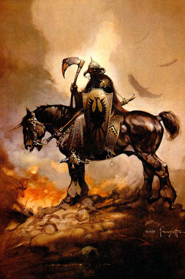
Like the infamous Death Dealer, for instance:
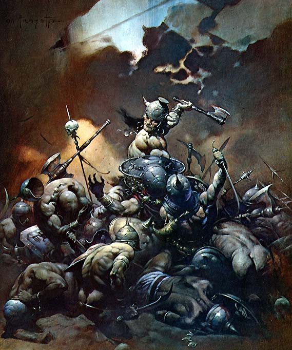
Or his work with Conan:
And so on..
I think the biggest difference between Frazetta and Vallejo is that Frazetta attempts to convey a feeling of action, and tries to capture things at the very height of that action in a fantasy setting, whereas Vallejo simply attempts to portray fantasy characters and creatures in the most super-ultra-realistic way possible.
Still, looking over his fantasy work, you can tell Vallejo takes a lot of cues from Frazetta. I even came across one that by him that was more Frazetta's style than his own, almost like an imitation. Can't really blame him though, as just about every fantasy artist takes cues from Frazetta... he was basically the master of his time.
Is anyone else finding themselves wishing that Frazetta would've done some game covers?
yeah, you're right. The works you pulled are better examples. But even the drawings above convey the point. Boris' figure is just standing there. Frank's horse is racing for his life, Buster Crabbe (the guy) is leaping to take charge, the babe is just... well... demure as can be.
You can just imagine boris' drawing being that of a model standing in front of him. Frank's drawing would be literally impossible to pose. One drawing is like a still frame from an action movie, one is just.... still.

I thought of this thread recently when I happened to see the art in question: Swords & Serpents.
http://www.mobygames.com/game/nes/sw...CoverId,51874/
It's hard to believe he did PSIV, given how much clothing everyone is wearing.
"There is much pleasure to be gained from useless knowledge." --Bertrand Russel (attributed)

I literally had the above though when I read this thread, but it does make sense I guess. It does look like Vallejo just... um. Clothed Vallejo. lol
I'm still curious about this "Ironsword is a microcomputer port" thought too - I didn't play Ironsword as much as W&W1 but since I became classic computer-obsessed in the last couple of years I'd like to try the original if it exists.
(I recently tried the original Bomberman... on ZX Spectrum. Wow... how far that game has come. The later ZX title Bomberman Deluxe is basically what the NES game came to be)
-AB+
Holy crap. It's been a while.
I was about to say, "Wouldn't it be funny to see Vallejo's interpretation of Bomberman?" Then I remembered Bomberman Act Zero.
"There is much pleasure to be gained from useless knowledge." --Bertrand Russel (attributed)

i love boris vallejo's work. Yes it takes styling cues from the other guy
but man he painted some stuff that made you go "what the hell was he smoking to come up with this stuff" lol
but at the same time memorized you by making you imagine yourself in this world with these hot chicks and super weird creatures and such
.... kinda like..... heavy metal
I agree, and I've come to appreciate it in the ...11 years (!) since that first post.
Let me come up with a list. It took 11 years but we can answer the OP now. Some definite classics in the list!
Last edited by Bronty-2; 01-03-2017 at 01:27 PM.
so here's a list, as complete as I could get it in the 10 minutes I wanted to spend, of boris and julie covers. They worked on each other's stuff during this time so I am lumping them together.
dragon wars
shannara
onslaught
demise
ax battler
golden axe 2
turrican
eric the unready
swords and serpents
phantasy star iv
double dragon v
strider 2 genesis
ecco
ecco 2
ecco 2000
hardball
star control
eternal champions
run saber
demons crest
castle wolfenstein 3d
splatterhouse 3
king of dragons
natsume championship wrestling
defender of oasis
wings of wor
conan pc
mike ditka football pc
ryl pc
super valis iv
warrior of rome 2
a fork in the tale
Last edited by Bronty-2; 01-03-2017 at 12:59 PM.
I assumed Mystic Defender was a lazy effort Julie Bell cover. It's got those damn 'plastic' dragons that she and Boris love to paint, as well as the excessive chrome effects. The character looks pretty shit though. If it isn't Julie (or Boris) it's someone trying to paint like them.

I'll ditto the (decade old) comments that Boris and Julie are at their best with high fantasy pieces. Anything with any degree of sci-fi, futuristic elements is.....echh. The Phantasy Star IV cover is particularly awful (though not really SF-ish, even if the game itself is), in the same kind of way that the Suikoden cover is awful, or any of the Valis covers. I don't know what geniuses thought it was a good idea to match games that had a distinct anime-style aesthetic in-game with very Western-style art for the covers. If only all publishers could've been as smart as Squaresoft was when they released Chrono Trigger in the US.
I also feel bad for Demon's Crest. The game is infamous for getting negative sales one week (because more copies were returned than bought), and I'm sure the cover did not help with that, considering how terrifying and Satanic Firebrand looks. I mean, yeah, he's a demon, but he's not THAT ugly and scary looking in-game.
That's not her at all. One quick way to note that is it seems to be partially airbrush and boris and julie were both 100% traditional brush. They also signed all their pieces and this is unsigned.
I quite like that cover anyways. I think the three dragons are nicely rendered. The figure could be better but serviceable and the background is nice and nice overall sense of drama with the orb and lighting effects and whatnot. If I'm 10 I probably look at that and think "fucking awesome" which is all they were going for

Last edited by Bronty-2; 01-03-2017 at 04:33 PM.
I liked the covered when the game came out; I was 15 then though.
IMO that's looking too deep into it and drawing connections that weren't really there when it comes to matching in-game styles and box styles. Its as simple as western audiences weren't receptive to eastern art at the time, and so the standard practice was to re-do the art for almost any game. Sometimes that worked out well and sometimes it didn't.
I spoke with the artist of dragon warrior 3&4 (US covers) and he said he the language issues were huge. Given very little to go on, apart from a bit of time with technical people to whom he spoke through an interpreter (who in turn should have had an interpreter...engrish) and a bit of in-game on a vhs tape.
These american artists had a hard job and precious little time to do it. Easy for us to pick it apart 25 years later but that's how these things were back then. The industry was still growing and globalization hadn't arrived yet. I for one think the stuff they came up with, generally speaking, was great. Yeah some are better than others but the same can be said of the japanese and european pieces too.
Right, so I guess you look at that now with adult eyes and want it to look appealing to adult eyes... I guess I just try to appreciate it for what it is /was, in the same way I can look at super mario bros and think the in-game graphics are fucking great without trying to apply ps4 graphical standards, you know?
 Posting Permissions


 Reply With Quote