

Which do you prefer - the black label box art of the original 12 NES games or their Famicom counterparts?
For myself, I prefer the Famicom Box Art since they have more personality compared to a stiff screenshot with a black border.

Black Label NES Box Art
Famicom Counterpart Box Art


Which do you prefer - the black label box art of the original 12 NES games or their Famicom counterparts?
For myself, I prefer the Famicom Box Art since they have more personality compared to a stiff screenshot with a black border.

Same here, I much prefer the famicom artwork. In fact, the American box art for most nes games is pretty bad. The biggest tragedy is the guardian legend, since the box art for guardic gaiden is stunning.

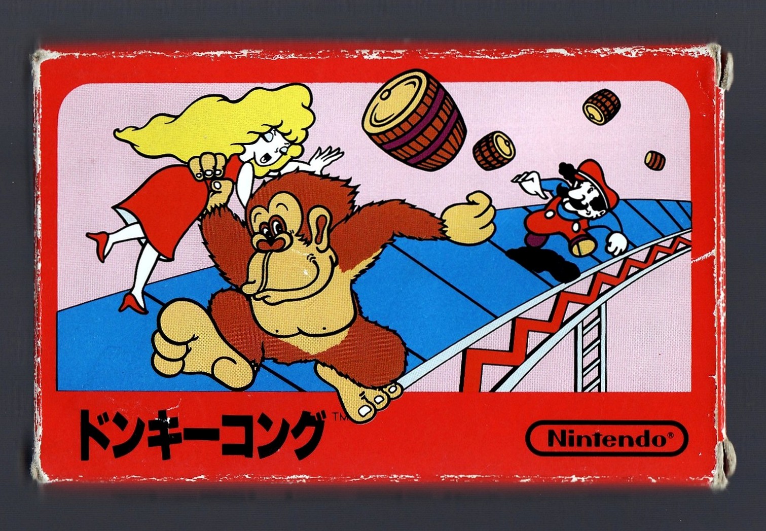
Famicom box art over the nes black cover art.

Guardian Legend isn't the same as the early Black Label Box Art.Originally Posted by Graham Mitchell

Personally, I prefer the Famicom Counterparts, but there is some retro charm in the antiquated, pixelated black label box art. But that may be nostalgia talking. The famicom ones are artistically superior while still being charming. I haven't seen them all, though, so there may be a couple that don't fit the scheme, but compare:

While I cast my vote for the NES Black Box series, it really isn't an either or situation for me when it comes to my preference over these two styles of box art. They are both charming pieces of retro gaming art with their own merits. Supposedly the NES' Black Box series sported pixel graphics on their cover to assuage any concerns over the game's graphics in the post 2600- sweet box art is deceptive- world. I can't recall the source for that, but it sounds fairly reasonable.

Indeed, false choice. The Donkey Kong example above is a great example where just going with the sprite art is OK if it means you don't outstrip the artists' capability. The FC art for Donkey Kong doesn't look too great IMO.
It's not Black Label era, but an interesting example is Kage, versus Shadow of The Ninja, versus Blue Shadow (the PAL release). The original FC cover is mostly an abstract swirl (although good depictions of the heroes and a dragon, exploding out of the title word, appear), Shadow of the Ninja is the usual Westernized attempt which falls a bit short (and the composition of the art and logos, and the choice of font for the title itself, is quite bad), and Blue Shadow looks rather good (although once again the title font is kind of bad).
The Famicom Disk System versions of Super Mario Bros. games, as well as Legend of Zelda and some others like Metroid (that on the US package design are still borrowing from the black box aesthetic formula, just in gray), are light years ahead of the black label boxes, of course. Our Metroid box looks terrible, the PAL version has an interesting realistic cover design like that of a movie, and the Japanese cover is cartoony but artistically striking. The Classics re-release of Metroid is neat too, and seems like it's biting into '90s 'tude for inspiration.
For a real Black box-to-FC comparison, check out Kung Fu versus Spartan-X. Spartan-X comes from the epic Jackie Chan film Wheels on Meals, and Wikipedia tells me something I did not know before I wrote this post - not only did it have the sequel Spartan-X 2 (which I did know about), Irem's arcade game Vigilante may have been intended to be the sequel too. Neat. (unintelligible gibberish from big enemy)
Last edited by Ed Oscuro; 05-08-2013 at 02:41 AM.
 Posting Permissions
As an Amazon Associate I earn from qualifying purchases. Similar agreements apply to other advertising or affiliate programs such as those from eBay, Google, etc.
Copyright © 1991 - Present of Digital Press. All rights reserved.

 Reply With Quote

