

Found this one in a stack of design documents. It looks nothing like the final cover.
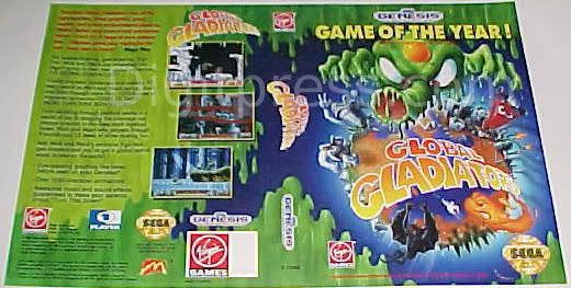


Found this one in a stack of design documents. It looks nothing like the final cover.

Thankfully, they went with the one they did.

I hope thats sarcasm.....this art is bad ass compared to the cheap ass generic 90s comic book style art anyone with a "how to draw comics" book could have made...Originally Posted by Emperor Megas

My Feedback thread: http://www.digitpress.com/forum/showthread.php?t=144938
I wasn't kidding. They're both generic, IMO, but that GAME OF THE YEAR! shit across the top of the case kills it for me, and it also looks a little too Slime World'esque for my taste. Plus, it doesn't have the actual Global Gladiators on it. I like the idea of the friends being on the cover.
Here they are side by side.

Any chance you'd be willing to scan that alternate cover?
Ready to print game covers and cart labels: http://www.mediafire.com/?5gm45wyxr3xvv
Its possible. I'll have to ask some people if it is ok first.
That game is awful. Don't give it attention!
Well it's only THE Game of the year !
I don't get all of the Global Gladiators hate I've seen over the years. I really enjoyed the game. I thought it had great animation and lots of charm, and I enjoyed the music as well. I liked the cool nuances like the way the character got blown back a little every time he fired his Supersoaker. The cute idle animations like him spinning his gun and winking, or snapping gum, the edge of the ledge animation, the way the machines spewing out toxins sound like they're more broken each time you shoot them. I really thought it was polished. The same with other Virgin games, like Cool Spot and Aladdin.
My biggest gripe about the game is that I thought that the stage were too long.

McDonalds games are generally just hated on because mcdonalds despite their quality. McKids was good, Treasureland Adventure was AMAZING, Donald in the Magical World for gamegear was almost as good, Global Gladiators was ok...hell, even Donald Land for the famicom was a pretty good game! There's really no bad games based on the fast food franchise, and that's far more than can be said for most franchises. Even disney TV icons like darkwing duck had a few stinkers (here's lookin at you, TG16 Darkwing)
*note: jp-only games are called "Donald" and not "Ronald" as his name there is Donald McDonald for those that don't know

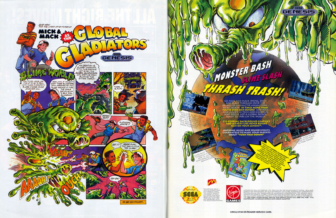
Pretty sure I saw that "alternate" art in a magazine ad for the game back in the day.
I found this ad. It used some of the same design.

I find it disappointing that the actual cart had no artwork on it, it looks to plain to me. Especially considering both of those box designs are pretty awesome imo. I do think I like the final better though.
It is strange that the cartridge has no artwork. Lots of Sega games have this problem.
Last edited by Buyatari; 01-29-2013 at 07:51 PM.
Yeah, I never understood that. Thankfully they improved the labels so they weren't like the Master System's.
 Posting Permissions
As an Amazon Associate I earn from qualifying purchases. Similar agreements apply to other advertising or affiliate programs such as those from eBay, Google, etc.
Copyright © 1991 - Present of Digital Press. All rights reserved.

 Reply With Quote